To kick off this cycles/rendering blog, here’s a material study! (i.e. I got bored and took some photos of random crap)
The idea is to build up a library of reference images that use similar lighting so that it’s easy to study different objects and their materials for subtle differences. This being the first, it’s pretty amateur.
Exposures are obviously adjusted, but white balance and lighting is consistent. In future I’d like to make a more isolated “studio” or sorts, with a proper backdrop, measurements and one of them colour cards you buy to make sure your white balance is correct and the lighting is a neutral colour. Which would mean I need some proper lights, since the ones used here are all sorts of different shades of yellow.
-
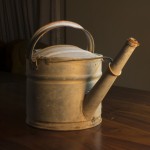
- Old galvanized steel/iron/something

-
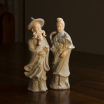
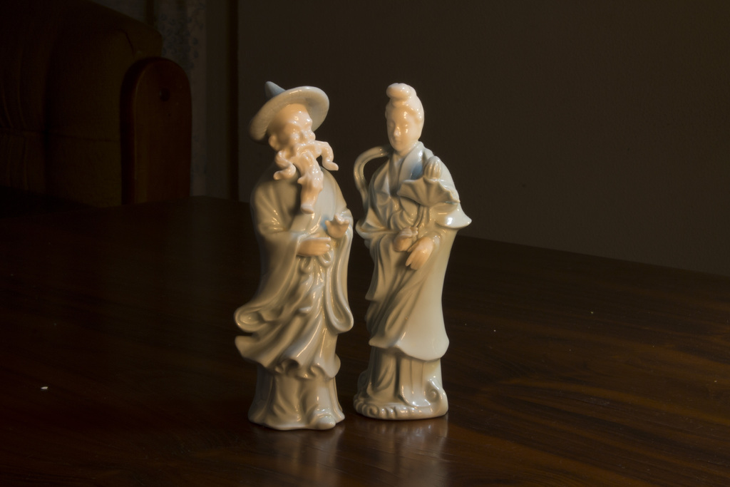
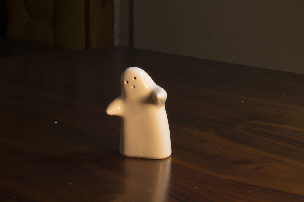
- Painted metal, glazed. Not ceramic!
-
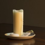
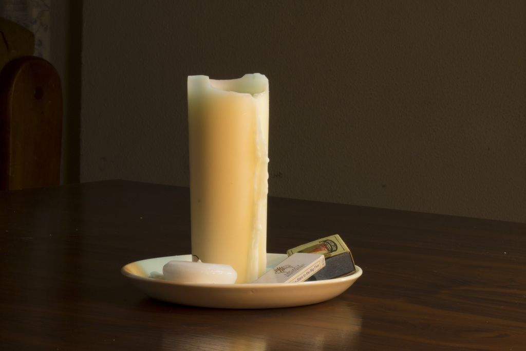
- Candle
-
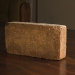
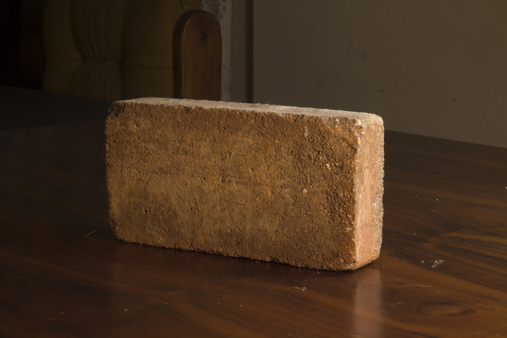
- Brick
-
- rough wood, but quite varnished
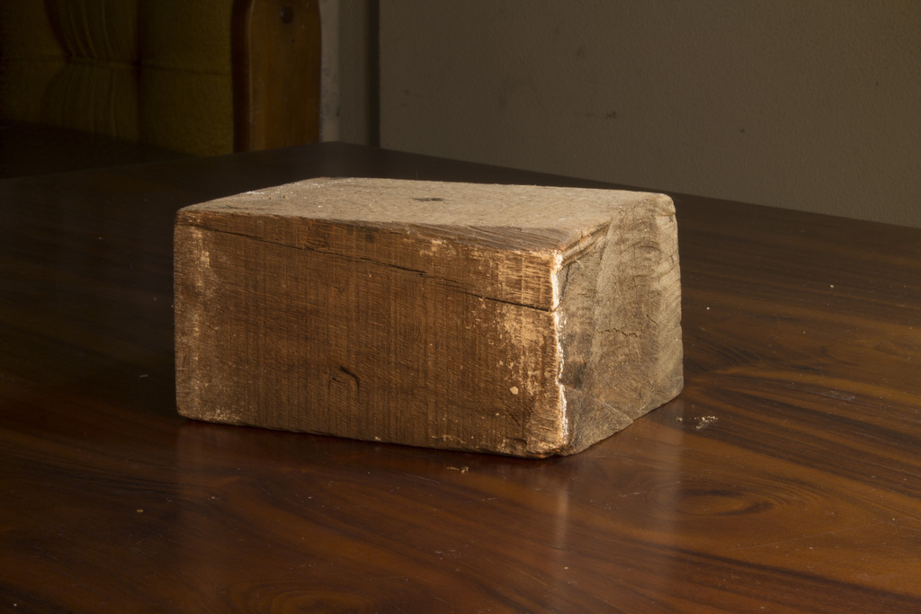
-
- Rough wood with a feint varnish
-
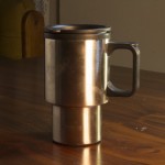
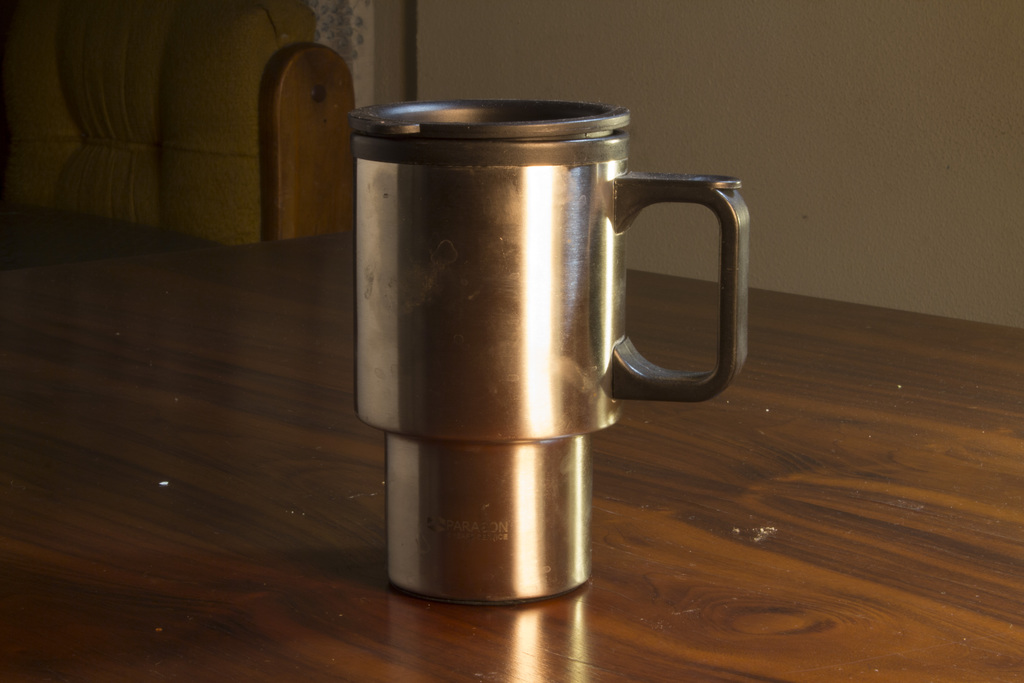
- Anisotropic steel (and matte plastic)
-
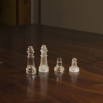
- rough vs clear glass

-
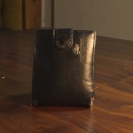
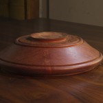
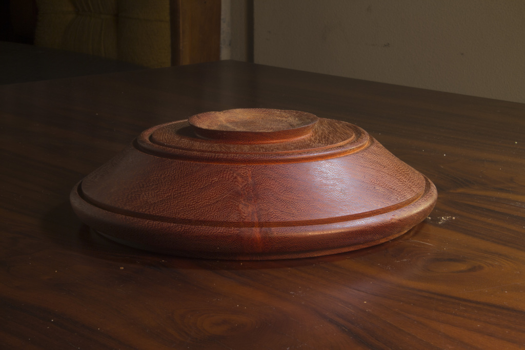
- Fake leather

-
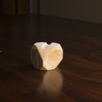
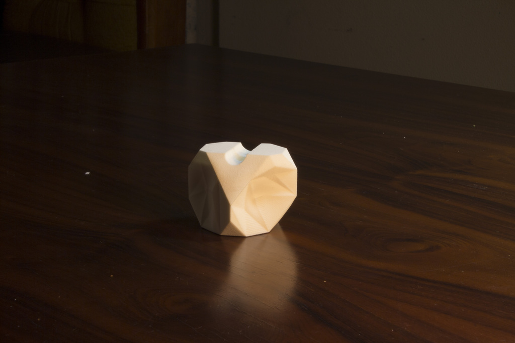
- Shapeways default material!
-
- Painted metal, glazed. Not ceramic!
-
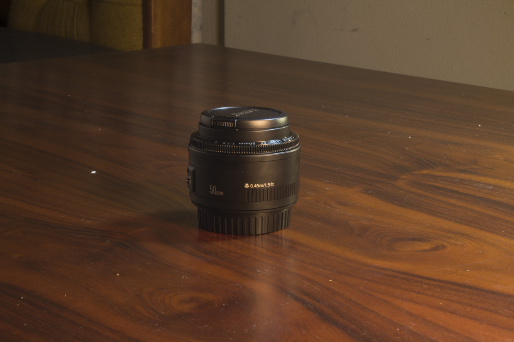
- Matte black plastic with a bit of slightly rough gloss
-
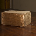
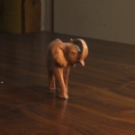
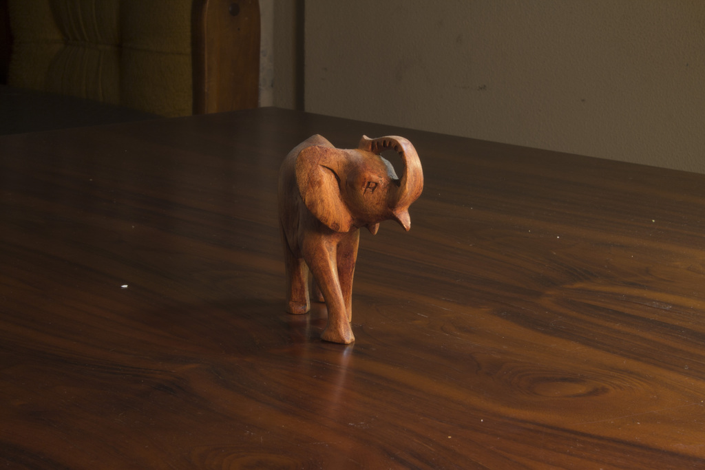
- wood, quite rough
-
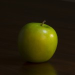
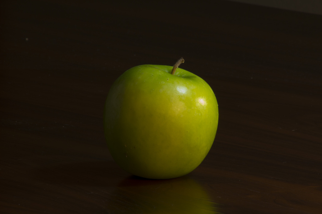
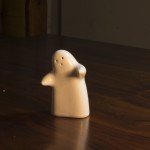
- Some kind of natural substance that humans put in their mouths