Commonly Ignored Feature #6: Dirty Vertex Colours

Modeled by 1DInc

Modeled by 1DInc

It’s a sort of quick, and fake ambient occlusion that you bake into the vertex colours of a mesh. It’s a little different from AO as it also gives some highlights on sharp edges.

2013-08-06_19-06-552013-08-06_19-07-04

Simply pop into vertex paint mode by hitting ‘V’ and run Dirty Vertex Colors from the Paint menu:

2013-08-06_19-11-16There’s a couple options you can play with in the toolbar (or by hitting F6) though the Highlight and Dirt Angle options don’t seem to be particularly intuitive.

To use these colours in Cycles, just add an Attribute node with the name of the vertex colour layer (“Col” by default).

2013-08-06_19-16-24

If that material is used by other objects, don’t forget to add Dirty Vertex Colors to those ones too, or just make a plain white colour layer, otherwise it’ll just be black.


PS: The image at the top takes roughly 2 hours per frame… I’ve been rendering it on and off for months now


Commonly Ignored Feature #5: Using multiple UV maps

uvs

Unfortunately the Texture Coordinate node only gives us the active UV map (as indicated by the highlighted camera icon) and gives us no way of choosing which UV map we want.

Luckily we have the Attribute node. Simply enter the name of the UV map you want and connect the Vector output to anything you like to use those coordinates.

attributeuvs

That’s it. Yeah a short and quick CIF this weekend, I’ve got a tight deadline and am fighting bugs… more on that later.

Commonly Ignored Feature #4: UVs are Colours

Not just UVs, but any texture coordinate.

tex_uvs


If you connect the UVs of an (unwrapped) plane to a shader’s colour, this is what you’ll see. Basically, texture coordinates are simply an ‘image’ of sorts, where the red value corresponds to the X-axis, and the green value corresponds to the Y-axis (and for 3d coordinates like Generated or Object, blue is the Z-axis.)

Why do we care?

It allows us to manipulate these coordinates as if they were colours (which I suppose they are):

tex_distort


Here I’ve simply added a Musgrave texture to the UVs, and plugged that into the Vector input of the image texture:

tex_shift_nodes


Don’t forget that, except in the case of shaders, a socket’s colour is only a visual indication of the data it gives/takes and not a strict law – vectors and colours are essentially the same thing, three values, hence we can mix them up and use them together.

But those bricks look ugly you say? Well yeah. A more practical example would be to use the Random output of the Object Info node (yeah, again) to give each object (which have the same UVs) different offsets – so if you have a billion objects that are all the same, an easy way to break up the repetitiveness is to change the texture coordinates of each of them randomly.

tex_shift


That’s all folks!

I’m trying to post these ‘Commonly Ignored Features‘ twice a week, so let me know if you think of something I could share!

Commonly Ignored Features #3: Object Index Node

gumballs

Now before you ignore me, I’m not talking about compositing here. I’m talking about the Object Index output of the Object Info material node:

object_info

The cool thing about this is that if you give a whole bunch of objects a single material, then you can still vary the material for each object by using the Object or Material index:

passindex2

In the image at the top, I used a little bit of python to give each selected object a random index inside a certain range:

import random
for obj in bpycontext.selected_objects:
    obj.pass_index=int(random.random()*(640-440)+440)

The range (between 440 and 640) is actually the range of colours in wavelengths. So plugging that into the wavelength node will give me a random colour for every object:

wavelength_gumballs

But we could do that with the Random output of the same node, albeit with less control, so here’s an even better example:

When you have a bunch of objects using the same material and you only want to change one of those objects, for example scale the texture up or down, you can use that object’s index as a mask and mix two things together with it. In the case below, making the object that has a pass index of 5 use tighter textures:

passindexSince we currently lack an “Equal To” mode for the math node, we need to use the product of Less Than and Greater Than modes. The object index is an integer, so using 5.1 and 4.9 for those nodes respectively we can be sure that we’re only getting the index of 5.0

Optimization Tip:

The mapping node’s Scale ability is really just multiplying the UVs (which is really just an ‘image’ where red and green represent X and Y coordinates, plug the UVs into an a shader’s colour if you don’t believe me). So instead of using two mapping nodes in the example above, use a Colour Mix node on Multiply with the same scaling values for the R, G and B and use the Object Index for it’s Fac.

Commonly Ignored Features #2: Contrasty HDR Lighting

Update 2016: This method is pretty much just wrong. See this post instead.

At the time Cycles came out in Alpha, I was playing around with HDR lighting in Blender internal. I found BI to be annoyingly slow and impossible to get that magic one-click lighting that all the non-blender websites had promised HDR could do.

You might remember some fool using this in some tutorial...

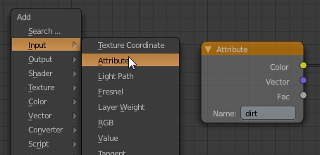
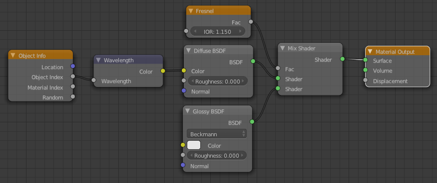
You might remember some fool using this in some tutorial…

So when Cycles showed up, I figured the day was saved and all my problems would magically disappear.

Well most of them did, but HDR lighting still looked flat and boring, lacking the shadows from the sun even in simplest of outdoor images.

hdr_bad

However, a couple years (has it really been that long?) later and I can now tell you where that magick one-click-lighting button is!

hdr_good

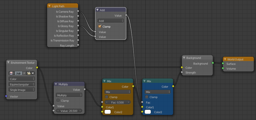
Well its not technically a button… but a single node connection:

hdr_nodes

All you need to do is connect the image to the Strength input of the Background shader and it’ll use those awesome bright pixels of the sun as the strength, meaning the sun is actually brighter than all the other white things! Hence the awesome shadows and realistic lighting.

The Multiply node is there to control the strength of the light, I increased it to 2.0 since it was a little dark, but it could probably even go higher since the shadows are a bit dark here.

Update:

Don’t forget that we’re working with nodes here people! Anything’s possible!

hdr_joined

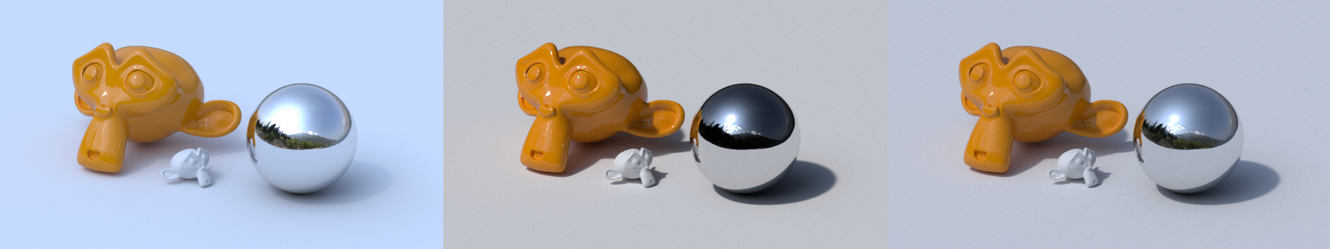
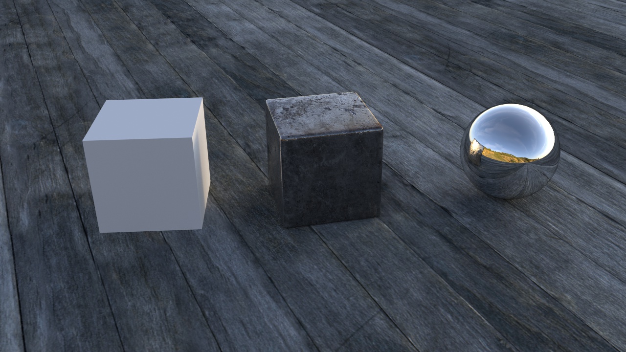
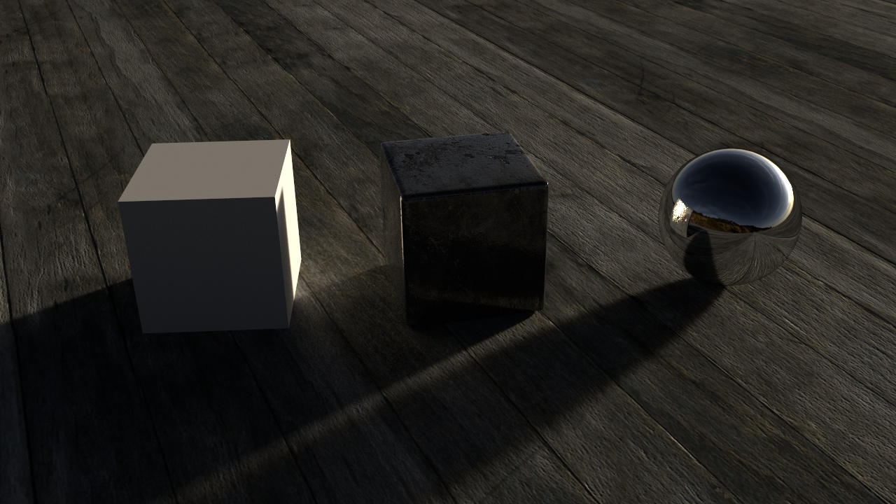
On the left is the plain setup with the HDR plugged just into the colour.
The middle is with the node setup above, the image plugged into the strength too (brightened with a multiple math node)
And the right one is with some extra adjustments:

hdr_nodes

Notice that the colour hasn’t been altered at all.
The Multiple math node is just to brighten it up, but the orange mix node mixes that strength value with white, effectively decreasing it’s contrast and making the shadows less harsh (thanks to Sir Reyn for the great idea!)

Now the blue mix node is where it gets a little more technical: The Light Path node gives us access to the different sorts of light rays. It’s common to see people use the Is Camera Ray to make something look a certain way to the camera, but behave differently for the rest of the scene – for example making a glass object look like glass to the camera, but the rest of the scene perceives it as plain old transparency, thus eliminating caustics.
Here we’re adding the Is Camera and Is Glossy rays (making sure to Clamp them so as to keep the result between 0 and 1 and continue energy conservation) and using that as the Fac of a mix between the strength driven by the image and a consistent strength (in this case of 5.0 since that’s what is bright enough for this HDR). So to the camera and in reflections (the glossy ray), the environment looks exactly as it did before we started messing with the strength, but it still lights the scene nicely.

Hope that isn’t too confusing for ya :)

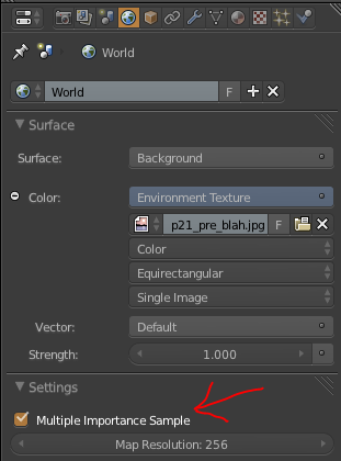
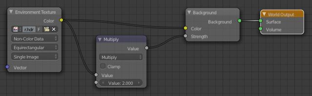
Also remember to enable Multiple Importance Sample and choose Non-Color Data for the environment texture.


PS: For those of you who have been hiding in a cave the last few years, Reyn’s blog is a great one to follow! A true artist he is :)

Commonly Ignored Features #1: Multiple importance sample

For lamps and materials it’s on by default, so most people tend to ignore it. In certain cases it can help to turn it off, but most of the time what you really want to do is turn it on for Environment lighting.

MIS

From the wiki (which I wrote ;) ):

Multiple Importance Sample: Enabling this will sample the background texture such that lighter parts are favoured, producing less noise in the render. It is almost always a good idea to enable this when using an image texture to light the scene, otherwise noise can take a very long time to converge.

If you’re skeptical about the Importance of this (see what I did there?), check out this comparison:


MIS off vs on

Both images were rendered for 25 seconds, the left did 1500 samples in that time, the right only 1000 but clearly produced a cleaner image.

If you’re using a particularly high res HDR, try increasing the Map Resolution, still keeping in squares of 2 (256, 512, 1024…). It’ll probably produce less noise, but at the cost of memory and render speed. Just play with it and see what gives the least noise for the render time.