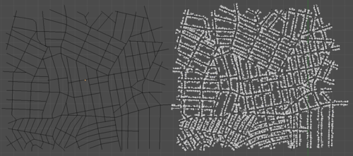
I worked on this for a good couple days… it’s not finished, but I suppose it’s slightly usable.
There aren’t many city generators available for blender… in fact I only know of one, which is great but not very versatile. You kinda get what you get. What I wanted was a city generator that was so customizable that you could create any shape city of any layout of any scale on any planet… yeah. Obviously if it demands such vast possibilities, it can’t all be automated.
The plan was to have the user give it a set of buildings, a few images for scale/height maps and terrain stuffs, and even give it the street layout. The automation part is simply the placement of buildings along the streets. Simple. Yeah.
It’s probably the most complex stuff I’ve ever coded, not the hardest, just a lot going on to keep track of and integrate, while still keeping everything very customizable. It’s about 600 lines, which I suppose isn’t all that much to a seasoned coder, but for me it’s much more than anything I’ve done before :P
Placing buildings mostly evenly spaced and along a street is pretty easy, the challenging bit was preventing buildings from being created in the middle of an intersection, and along many curves at once without overlaps.
The solution was to increase the curve’s resolution a lot, convert them to meshes and join them all into one object. Then do a Remove Doubles to weld vertices that are close together. Why? Because this will join the lines together, making a vertex at each intersection that connects to both/all streets. Which means a simple search for verts with more than 2 edges connected will give us the position of the intersections!
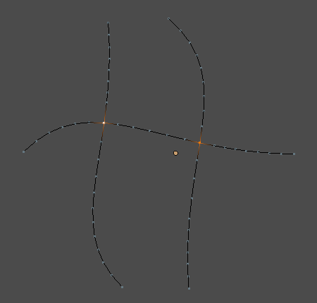
Deleting these intersection verts, separating the object by loose parts and converting it back to curves will give us the perfect set of curves to but the buildings on to make sure no buildings sit in the middle of an intersection.
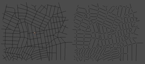 And that’s pretty much as far as I got. So it’s functional… just not really useful.
When I next feel like working on this, I’ve got a long list of todo’s… so probably not for a while.
The end goal would be to include a building generator and stuff like that too. I seriously considered turning this into a kickstarter, but at the moment I don’t really have the experience nor the time for something as epic as this.
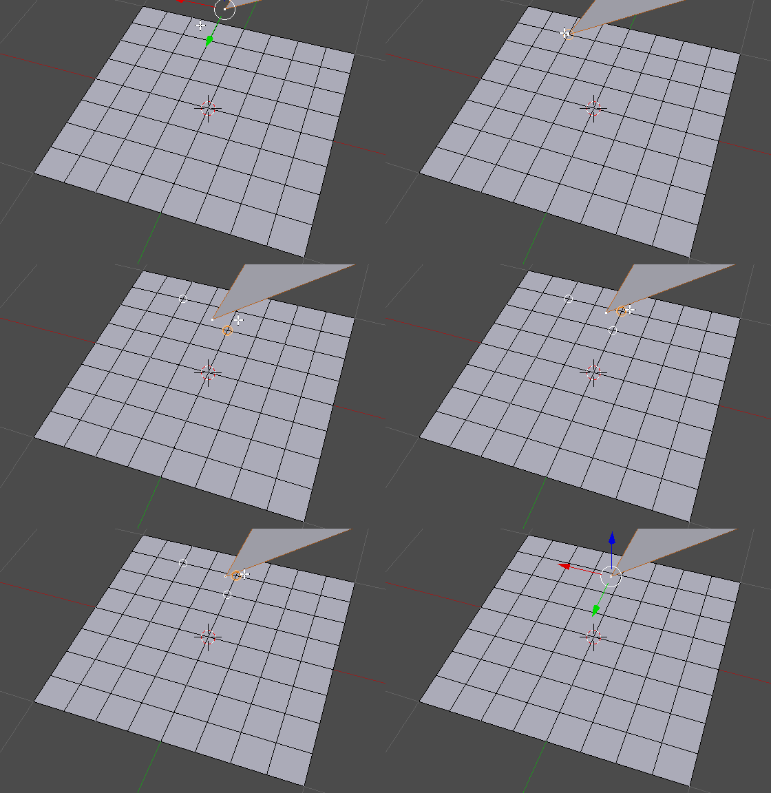


 And that’s pretty much as far as I got. So it’s functional… just not really useful.